The UX Design Institute Rebrand
The decision to rebrand the UX Design Institute was driven by the natural growth of the product and its evolving audience. When UXDI first launched, there was just one course, and a heavy focus on in-person workshops, meaning most of the materials were print-based.
Since then, the course offerings have expanded to include 8+ programs, with a focus on digital marketing. The audience also shifted — moving from businesses and career beginners to career-switchers and professionals looking to upskill, with many of these people already in the tech industry.
UXDI website branding from 2019
With these changes in mind, we needed a brand that could:
Be consistent and cohesive
Excel in the digital space
Establish UXDI as the go-to resource for all things UX
Reflect the dynamic, evolving nature of the tech environment
UXDI brochure branding from 2019
We started the rebranding process with a comprehensive audit of the UXDI brand, looking at its use across various touchpoints—not only from a visual perspective but also in terms of tone of voice, messaging, and overall positioning. We also researched the industry as a whole to understand how UXDI sat amongst similar organisations. One key finding was that there weren’t many examples of other organisations leading with design. This presented a clear opportunity to reposition UXDI as a design-driven leader in its field.
The wordmark and typography remained unchanged, allowing for a gradual rollout of the rebrand given our limited design resources. This approach also ensured brand continuity and recognition throughout the transition.
Colour palette
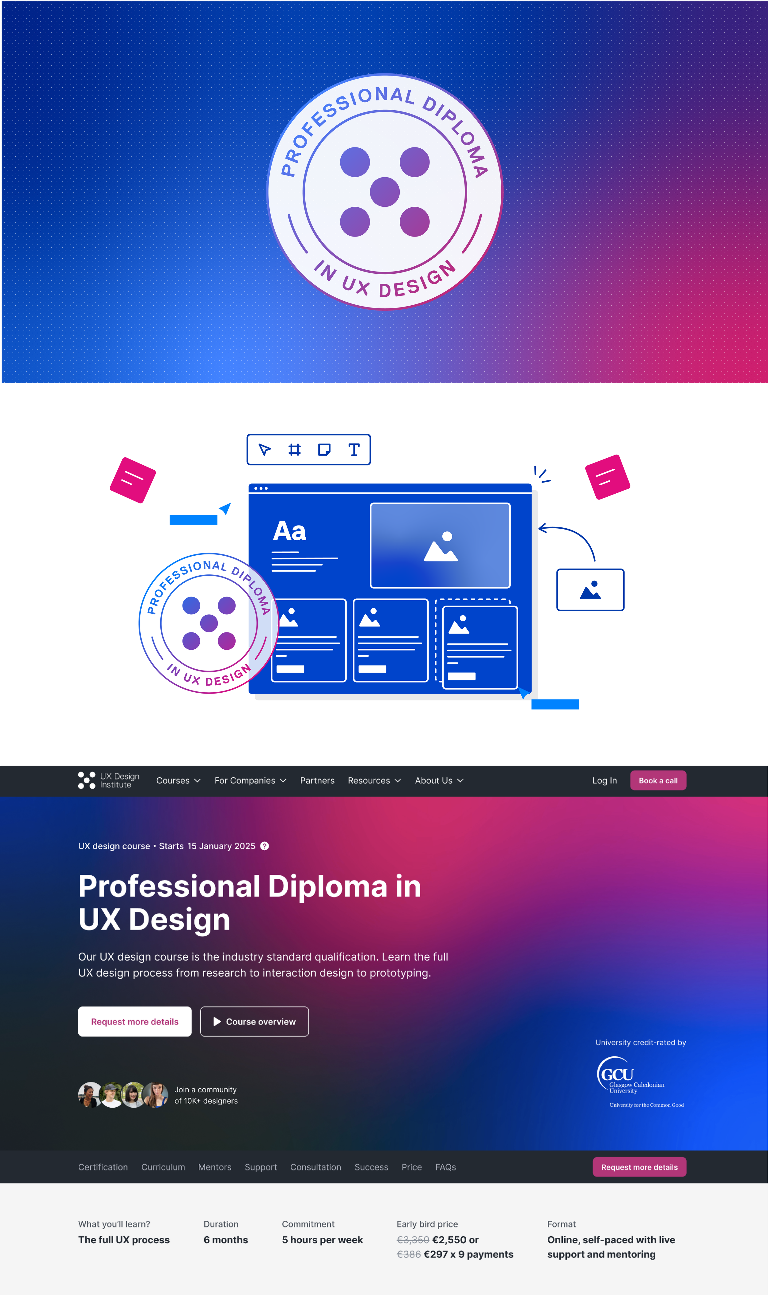
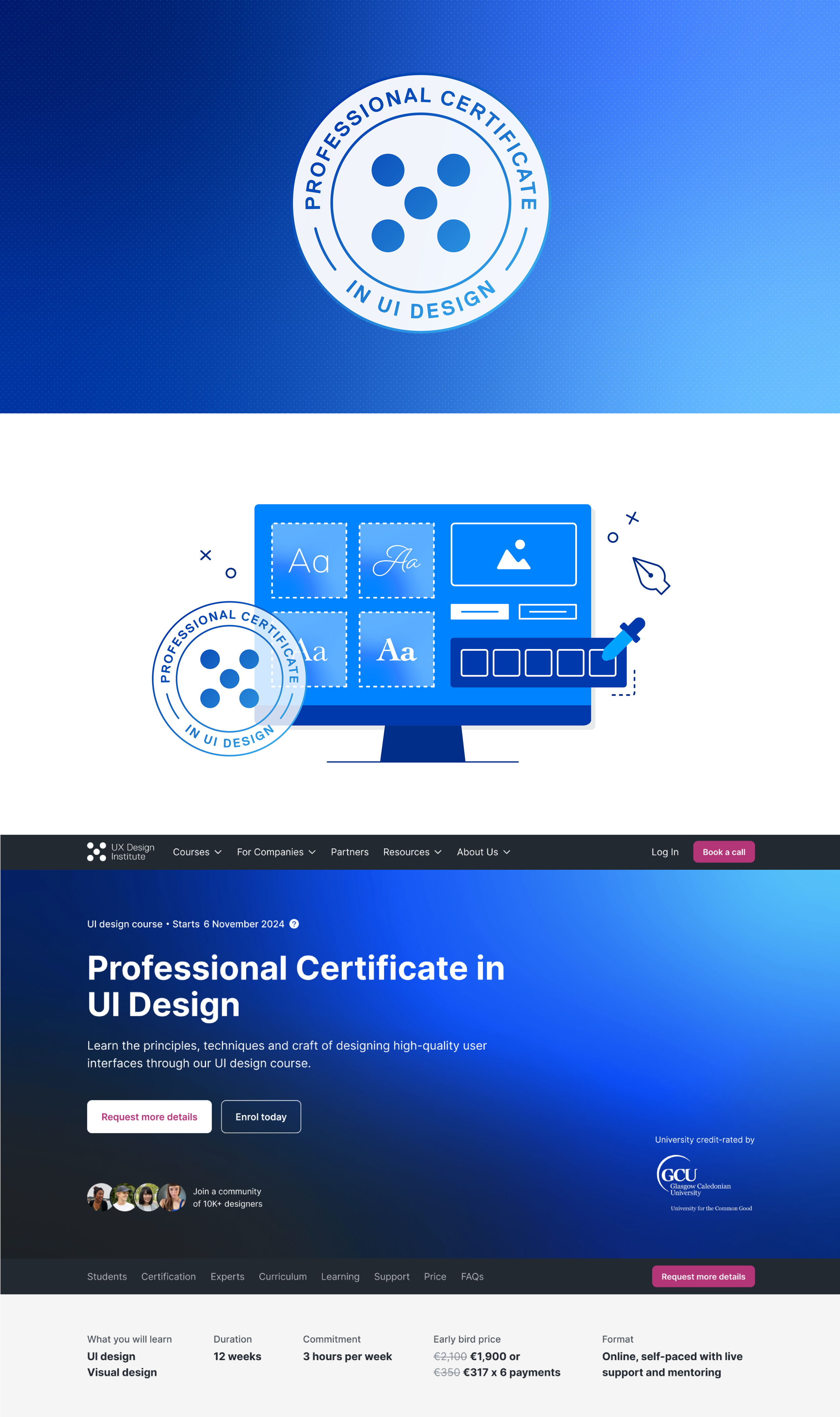
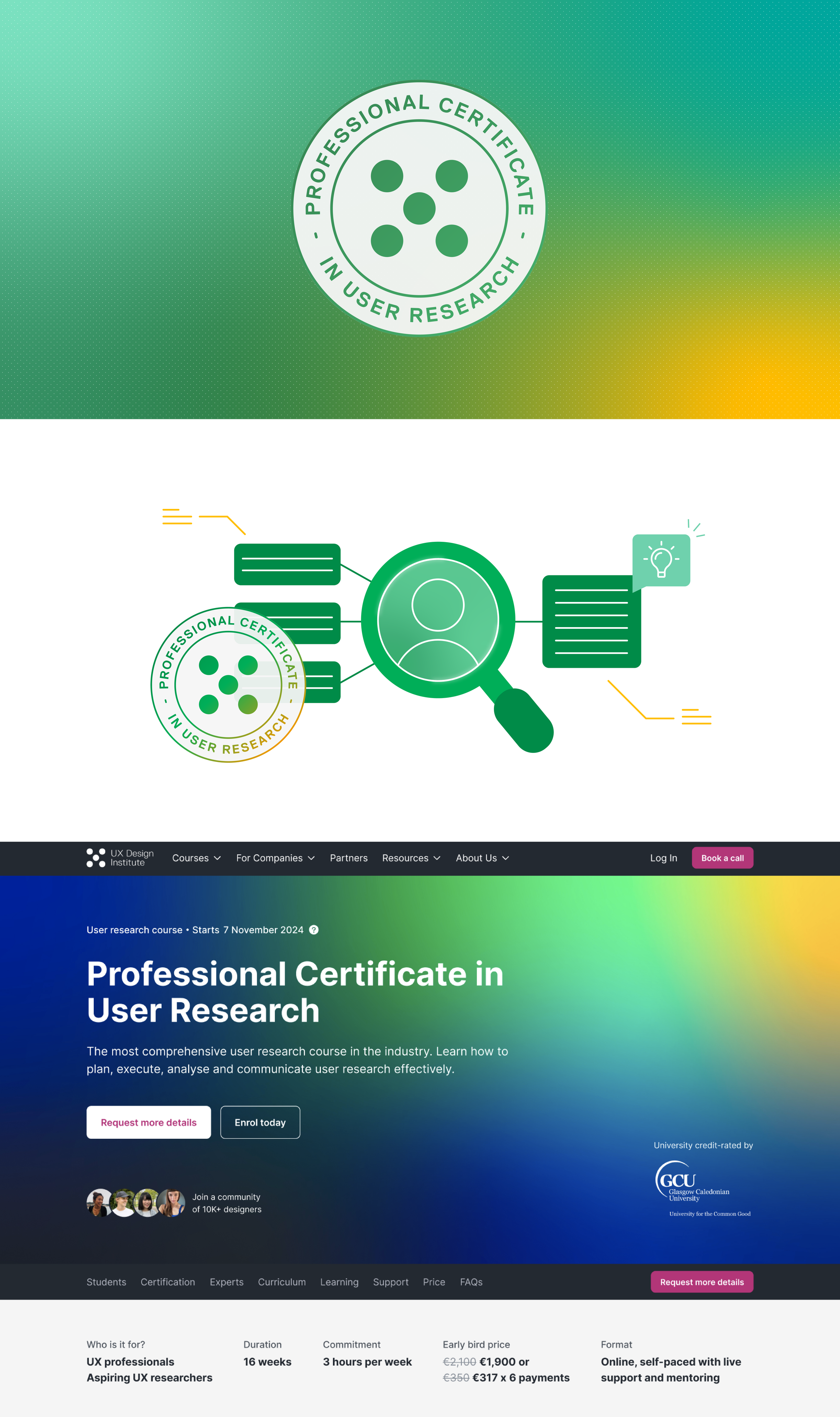
The first step was to introduce a modernised colour palette. This palette would not only lift our overall aesthetic but it would also allow us to create distinct sub-brands for each of our course offerings. The updated primary colours also improved legibility and accessibility, ensuring a more inclusive experience for all users.
Gradients
One of the unique components of the brand is the use of gradients. Primarily featured on our website and social assets, these gradients not only enhance the brand visually but also define the unique identity of each course.
Visual elements
We Introduced key visual elements such as mnemonics, to bring a playful, human touch into the brand. Rounded corners and buttons pay tribute to the current UX field, and dynamic illustrations bring life to the overall aesthetic.
A key success of this rebrand was the need to test the brand extensively due to limited design resource, which allowed for a faster rollout. Through continuous trial and error during the design process, we ensured that every decision we made aligned with the brand’s goals.
This rebrand not only refined UXDI’s visual identity but also strengthened its position as a design leader, creating a more engaging and accessible experience across all touchpoints.
Credits: Senior Designer: Bronte Messam | Designer: Medb McCarthy | UI Designer: Paul Schwer


